Ever wonder why others seem to be growing their list faster than you? How they are getting such high conversion rates?
Well I’m about to let the cat out of the bag.
Read on to discover the best actionable hacks and tools we know and use every day in our business. Implement these hacks to increase your conversion rate by 15x.
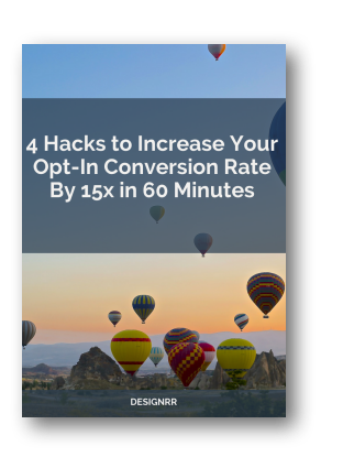
Free Download: Skyrocket your conversions with these super hacks. Grab your copy of the 4 Hacks to Increase Your Opt-In Conversion Rate By 15x in 60 Minutes in PDF.
1. Content Upgrade
A content upgrade is where you offer an ‘upsell’ piece of content within an article in exchange for an email address.
You should use a content upgrade with the majority of your blog posts, especially your top performing ones. The upgrade can be additional information about the topic, as in an extension of the post, something that is complimentary, or simply a PDF version of the post itself.
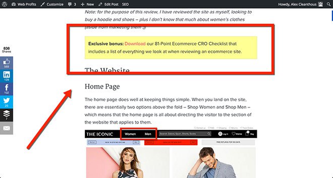
Image via ConversionXL
Here’s an example of a content upgrade used on The Iconic website review by Alex Cleanthous.
The content upgrade is an 81-point Ecommerce CRO checklist that includes a list of everything they look at when reviewing an ecommerce site (they used the same design style for the content upgrade as Brian Dean does at Backlinko).
In fact, Brian Dean was able to boost conversions by 785% in one day with his content upgrade. He says that traditional reports and courses just don’t work the way that they used to. You need to offer something different, namely the content upgrade. This simple strategy instantly increased his conversion rate from .54% to 4.82%.
Alex Cleanthous continues says that, “The key to getting the best results from a content upgrade is to create a piece of content that perfectly aligns with what the original article is about, and offers additional value that is so good that readers are compelled to enter their email address to receive it.”
Content upgrades work best with an epic post (3000+ words), however the real requirement is that you have content on your website that receives traffic each and every month.
To get started, find the top 5 -10 content pages on your website and create a custom content upgrade for each post. Once that’s done you can continue on down the list until you have a content upgrade for every page on your site that receives a good amount of traffic each month (note: ‘good’ is in context of your website, your traffic and your business – for some businesses it’s 100 visits per month on a content page, for others it’s 1,000).
It’s a bit of work to setup but if you’re getting ‘free’ traffic to your content each month from search engines, social media or directly then all you need to do is set it up once and let it run forever. The key is to make sure the content upgrade is evergreen (ie not time-based).
Take a look at this blog post where we use a content upgrade. You can click directly to it here.
In this particular post there are two call to actions that take you to the same content upgrade popup. The first is a similar box to the one seen in Backlinko and the second uses text to direct the reader with what to do next after reading the post. (The calls to action have been created with KudaniLeads)
Call to Action 1 – Located just below the fold.
Call to Action 2 – Located at the end of the blog post.
![]()
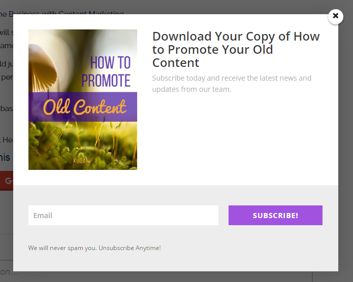
When you click on either of these calls to action you get taken to a popup where the visitor can add their email address to download a free PDF copy of the article.
Here is what the popup looks like:
The content upgrade itself was created with a tool called Designrr.
Here is a look directly inside of the PDF. As you can see it is a replica of the blog post stylized with a header, footer, and coloured headings.
Designrr is an innovative new technology that allows you to create instant lead magnets and ebooks from blog content. It converts any page on a website into PDF’s simply by adding the URL of the page.
With Designrr you can remove all the advertisements, banners, sidebar content, etc. and just have the images and text added to create a beautiful ebook.
Implement this hack to increase your conversion rate by 7x.
2. Calls to Action Hacks
a. Don’t Use Submit or Subscribe
Stop using generic terms like submit or subscribe as button text or in general on your calls to action.
“… nobody cares about the action of submitting. They care about what they’re getting in return” says Chelsea Baldwin.
Write button text that inspires action. Make it applicable to the offer you are giving. Make it relevant.
Your button text should be as clear and specific as possible to provide a rationale for a visitor to complete the offer. It needs to clearly communicate what will happen when they click the button. Think about a typical visitor to your landing page. They’ve stayed on your page long enough to be drawn to your CTA button. But they don’t click, why? Chances are you’re not providing effective enough button copy.
A great example of relevant button text is Lyft. As seen in the image below their button copy says ‘Become a Driver’. The visitor knows that they have to fill in the form and submit, however the words ‘become a driver’ are far more relevant to them.
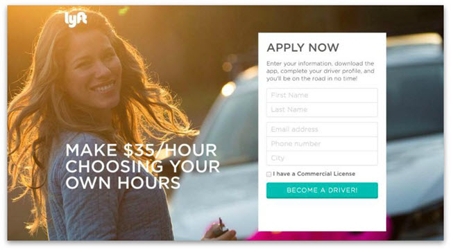
Image via SumoMe
Your call to action needs to be “an instruction to the audience to provoke an immediate response.” When you put “submit” on your call to action you mask what the action is. You may have an entire page or form to explain what’s going on but when’s the last time you read a page in its entirety? Make your CTA as relevant as possible to ensure visitors are clear about their next action.
Another great example is Fitness World, a major chain of gyms in Scandinavia. They increased conversions by making their button text more relevant.
In this case changing the CTA copy from, “Get Membership” to, “Find Your Gym & Get Membership” which increased click through to the payment page by 213.16%.
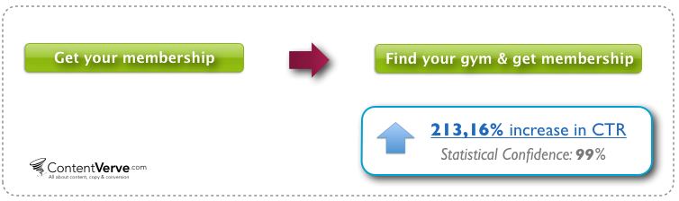
Image via ContentVerve
b. Change Your Wording from 2nd or 3rd into First Person
When you’re reading about a solution you can opt in for, all you’re thinking about is your problems and how this thing that’s being offered is going to make your life easier and whether or not it’s worth your money.
Which means that instead of thinking in 2nd person like a lot of website copy is written in, (which makes sense, it should be conversational), your end thoughts are all about your benefits. Which means your thoughts translate into things like “help me”, “my time”, “my money”, and “I want” or “I need.”
So instead of writing button text that says “Get Your Free eBook,” write button text that says “Send Me My Free eBook.”
It can feel a little odd at first, since you are the marketer writing to the prospect. But changing the wording of the CTA around to first-person eliminates brain friction where the prospect’s mind has to translate your second-person into their own first-person thoughts. HomeLight does this exceptionally well.
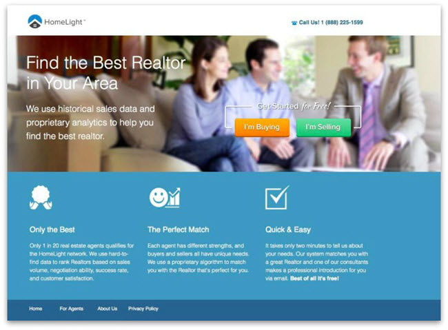
Image via SumoMe
A recent split test of an Unbounce landing page for a free 30 day trial confirmed the conversions of this hack.
The only thing they did was to tweak one word in the copy – they changed the possessive determiner “You” to “My”. After running the test for three weeks, the treatment button copy, “Start my free 30 day trial” had increased the click through rate to the payment page by 90%.
Implement these two hacks to increase your conversion rate by 3x.
3. Best Positions for Your Calls to Action
Simply adding a call to action on your website is not enough. If you want to maximize conversions you need to strategically consider placement.
Read on to discover the top converting places to add your optin boxes.
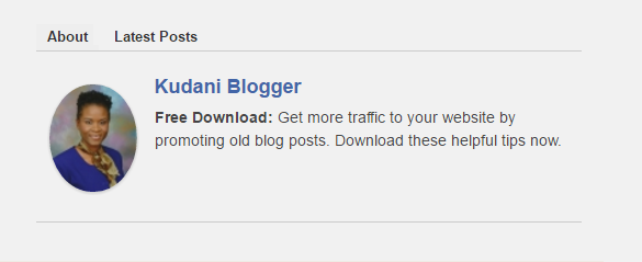
a. Add you call to action in the author box
The author box is often a forgotten area, while at the same time it is one of the most viewed and clickable parts of a blog post. Readers are interested in knowing who wrote the article they are reading. But more importantly, if they have really enjoyed it they will want more, which is exactly why this is an ideal place for a call to action.
Maria Stenvinkel is a newcomer in the blogosphere. She doesn’t even have her own blog online yet! She does, however, have an optin landing page which converts at an amazing 48%.
Maria’s strategy is that she wants to grow her audience first. This way when she is ready to start her own blog she will already having a following. She does this by writing guest posts. In her author box, Maria invites readers to click through to her landing page:
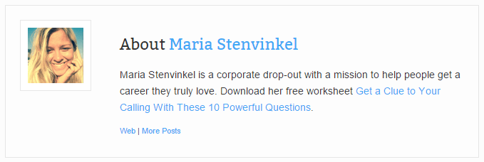
Both the text in the author box and the optin page it leads to are clear, concise, and very enticing. Most people who land here will feel the optin offer speaks to them, not only because of the obvious value it’s presenting, but because of the connection they feel to the author.
This particular hack involves adding any text you want, making it clickable, and using a lead capture plugin like KudaniLeads to add subscribers to your list.
Take a look at how I replicated the hack. I’ve included all the steps and tools I used below.
Here’s what you need to do:
First, start by installing an author box plugin that allows you to add text, shortcodes, and html. In my example I am using Starbox. You can get it here.
Second, you will also need a popup plugin that allows you to add clickable text. I am using KudaniLeads.
With KudaniLeads create your popup and then grab the short code. Paste the shortcode into a text editor of your choice (like Notepad). You will see two sets of square brackets each with content in between. At the point of the first square bracket closing and the next one opening type the text that you want the reader to click on. You can use html here. For example, if you want something bolded use <b></b> or <strong></strong>.
Once you have finished writing your text in WordPress go to Users > Your Profile, scroll down and you will see the box where you can enter your custom text. Copy and paste the shortcode and text that you have in Notepad and click save.
This is what it looks like:

Go to the front end of your site and voila you have a clickable author box.
b. Add an exit intent popup
Exit intent technology is one of the most used placements of popups with strong calls to action. And rightly so because it works.
Neil Patel tested popups with exit intent technology for his site NeilPatel.com. He was able to increase conversions by 46%. You can see similar exit intent pop-ups on Quick Sprout too.
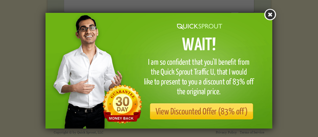
Image via CrazyEgg
Exit intent popups are one of the only placements that gives you maximum visibility.
So what are they?
A movement triggered popup. As the reader begins to move away from your page without signing up or buying a popup appears. The popup overlays the web page that they are on.
Here’s a great example shared by Convince and Convert where Gr8Fires used exit intent technology increasing their email signups by 300%.
To increase email signups, Gr8Fires equipped its product pages with exit-intent technology. But rather than offer the usual e-book or discount, Gr8Fires decided to get creative with their offer: a free calculator that allowed prospects to determine the exact cost of installing a Gr8Fires stove in their home.
Here’s a screenshot of the exit overlay activating on a product page:
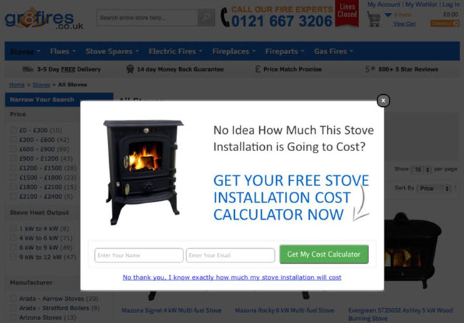
Image via Gr8Fires
The exit overlay has excellent visibility and relevance. The calculator breaks down installation costs of products on the page, and the modal lightbox greys out distractions on the page behind it.
And most telling of all: Gr8Fires enjoyed a 48.54% lift in sales from web users who used the installation calculator, compared to web users who had not.
If you are worried about irritating visitors or disrupting the user experience, here’s what Angus Lynch had to say…
Exit overlays open within the current page, not in a new window.
- Exit overlays don’t disable or restrict the navigation or inhibit users from leaving the page.
- Exit overlays activate only when users are about to abandon the page, so active browsing sessions are not interrupted.
- Exit overlays can be targeted to specific pages and users. For example, returning users can be excluded to avoid repeat views.
c. Add a notification bar at the top of your website
Another great place for high visibility is the top of your website. Just think about it…how often have you visited a website and read the content in the top bar?
From a psychological perspective this is ideal. Our eyes naturally gravitate to the top as this is where we customarily begin reading. Many website owners use this placement for displaying important information, including strong calls to action. Use it to showcase your latest blog post, getting subscribers to your newsletter, presenting an offer, etc.
Here’s an example I created using KudaniLeads.
![]()
Derek Halpern used a notification bar to gain 1,180 new email subscribers in just 30 days.
He says, “When people visit your website, they’re laser-focused on finding what they need. In most cases, they’re looking for something specific, but they’re willing to check out something else that grabs their attention too.” And that’s exactly where the notification bar comes in.
He recommends that you:
Offer a tangible bribe – use text that encourages readers to click
Send traffic to a landing page – the main goal of the page is to get emails in exchange for either a physical or downloadable product (it converts around 70% of the people that hit the page)
Moreover, he says to eliminate distractions, use active text, minimize content width and include a prominent call to action.
A Phoenix based restaurant also enjoyed a 70% conversion rate with the addition of a notification bar on their website.
The owner Andrew Fritz says, “During the month of August, I had a total of 9,303 visits to the site and 499 clicks on the reservation widget,” he says. “In September, I actually only had 8,428 visits and the reservation widget number dropped to 474. But, since I added the notification bar in site for Restaurant Week, it gained an additional 374 clicks on top of that. Together, that brings the total number of reservation clicks for September up to 848.”
Here’s what the notification bar looked like. Notice also how relevant the copy is.

d. Make your home page an opt-in page
What better place to have an opt in than your home page? After all it’s the first place people land on when they visit your website.
While this hack may not be suitable for everyone you may want to consider an easy alternative. Tons of new tools seem to be cropping up allowing you to display a full screen call to action over your home page. SumoMe with its Welcome Mat and OptinMonster are just a few.
In fact, Optin Monster claims that you will double your conversions using a full screen welcome gate. Moreover, adding big buttons with words like “No thanks” or “I am happy with low traffic” outperformed others converting at 34% according to data from ConversionXL.
The strategy here is that your home page is often the most visited page on your website, and often times by people who already know you (ie return visitors). So why not use this page as an opt in page that sells visitors on joining your email database?
Here are some examples of home pages that are opt-in pages…
This is the home page of Brian Dean’s Backlinko website…
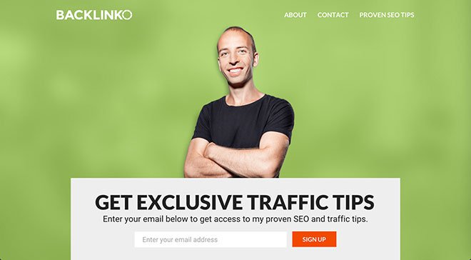
Image via ConversionXL
And this is the home page of Bryan Harris’ Videofruit website…
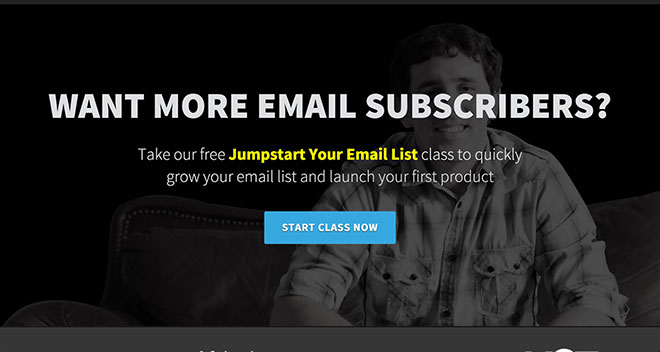
Image via ConversionXL
This is Neil Patel’s Quick Sprout blog…
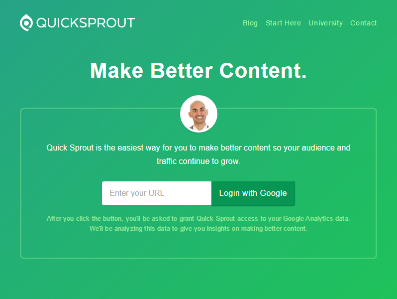
Image via QuickSprout
And take a look at some welcome gate full page opt ins…
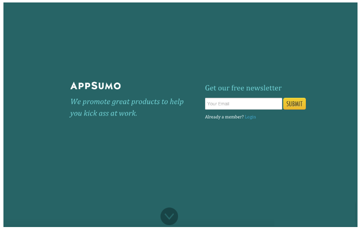
Image via SumoMe
Image via OptinMonster
e. Other recommended placements
Fly In (also referred to as a scroll or trigger box) – this call to action appears when the user scrolls down the website.
Image via HubSpot
Below Post – place your call to action at the end of your blog post. This is another great placement for high visibility.
Inline – an inline call to action appears within the blog post itself. This can be in the form of clickable text or image. The one shown here is also another example of a content upgrade.
Image via Femtrepreneur
Widgets – add short codes to your widgets. This place has primarily been used for newsletter sign ups, but why not try something else. Include a free trial or demo.
All of the positions recommended can be easily created with KudaniLeads, a premium WordPress plugin.
KudaniLeads has been proven to increase your website conversions 3x in only 10 minutes. It is a brand new groundbreaking lead capture technology that allows you to create 6 different positions for your calls to action and link those directly to congruent lead magnets.
Here is a visual of all the available placements (also included is a locked content area):
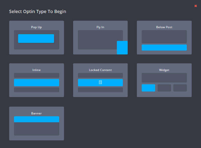
Implement four optins using any of the recommended placements to increase your conversion rate by 3x.
4. Use Powerful Headlines
Most people know the importance of headlines in their blog post titles, but quite often forget about them in their calls to action.
Headlines matter regardless of what you are writing. If you want people to click then they have to be captivated enough to do so and that comes from writing compelling copy.
Chelsea Baldwin says if your calls to action are not interesting and intriguing enough to make your site visitor think “Oh yeah, I want that NOW”, your conversions are never going to be what you want them to be.
Jacob McMillen at CrazyEgg, says, “Your headlines should be as clear as a flawless pane of soda-lime glass. This isn’t the place for ambiguity.”
Here’s an example he shared. See the difference?
“Increase Your Email List With This Simple Method”
“How to use a giveaway to get 2,239 email subscribers in 10 days”
Which one would you click on?
He says for a guaranteed win use these 3 simple steps:
- Take a headline
- Throw some numbers in
- Watch your conversion rate increase
Here are some revealing stats from Conductor. Just see for yourself.
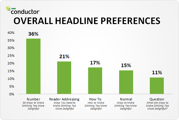
Image via CrazyEgg
Whenever you want a visitor to take action you must guide them. Your website needs to naturally walk them through where they need to go. If you want them to click somewhere, give you their email address, and so on it must be clear.
Here’s a great example provided by Brittany Leaning…
Madewell (owned by J.Crew) has always had standout website design, taking what could be a typical ecommerce website to the next level. Their use of CTAs on their homepage is no exception.
When you first arrive on the page, you’re greeted with the headline “I’m Looking For …” followed by a category, like “Clothes That’ll Travel Anywhere.” Below this copy are two options: “Yes, Take Me There” or “Hmm… What’s Next?” The user can choose between the two CTAs to either browse clothes that are good for travel, or be taken to the next type of clothing, where they can play again. This gamification is a great way to make your site more interesting for users who come across it without having a specific idea of where they want to look.
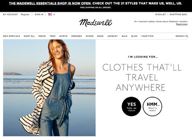
Image via HubSpot
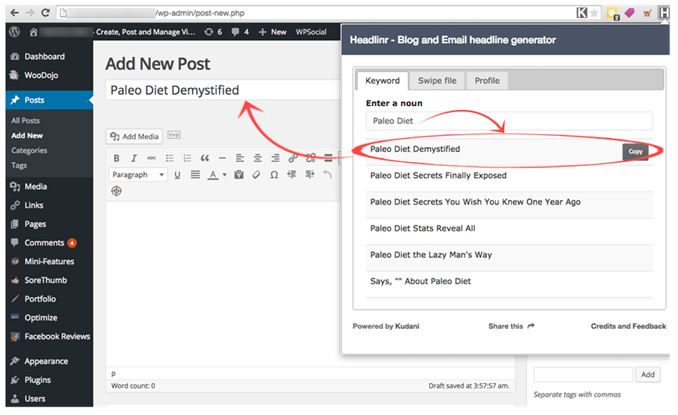
Whenever you are producing content, whether it’s writing sales copy for your optin box or landing page, you need to create headlines that convert. This can be extremely challenging and costly if you hire a copywriter.
Headlinr, which is a Chrome based plugin, lets you instantly create hundreds of high converting headlines that you can copy and paste where ever you want. Add them to your calls to action, blog posts, social media, and so on.
Simply enter in a keyword and watch as it automatically starts to produce a huge list of suggestions.
Headlinr is a free tool. You can download it here.
Implement this hack to increase your conversion rate by 2x.
Concluding Summary
If you implement the content upgrade hack you will increase your conversion rate by 7x. Next implement, the two calls to action hacks for a 3x increase. Then add in four optins using any of the suggested locations for a 3x boost. And lastly, the headlines hack for a 2x increase.
Add all of this up and you get 15 times increase in growth in 60 minutes. Want more? Add an explainer video to increase both your traffic and conversion rate.
Next Step: Download this article in a PDF (it was created with Designrr)